Table of Content
Yes, you guessed it right. Mobile first design is all about designing for the smallest screen first and working your way up. With nearly 4.2 billion mobile internet users and worldwide mobile Internet usage surpassing desktop in 2016, it is a user experience (UX) design sin if you don’t start your app’s design with mobile.
The concept of mobile first design came into the limelight in 2010’s Mobile World Congress, when Google’s then-CEO, Eric Schmidt, announced that the company would prioritize mobile users.
In short, mobile first design is all about delivering the best user experience to the right device by starting the design process of a website or app from the smallest screen and working your way up.
What Is Mobile First Design?
Before getting into what exactly a “mobile first design” or “mobile first rule” is, there are three essential terms you need to know – responsive web design, progressive enhancement and graceful degradation.
1. Responsive Web Design (RWD)
Responsive web design is a method that allows websites to fit within different sizes of screens, platforms and orientations. The technique involves the use of flexible layouts and images, combined with intelligent use of Cascading Style Sheets (CSS).
 Magic Leap’s website on mobile
 Magic Leap’s website on desktop
In short, RWD offers users the ability to access a website from any device without any compatibility issues. Without RWD, accessing a website will be tiring as the users need to pan and zoom excessively.
2. Progressive Enhancement And Graceful Degradation
With progressive enhancement, you start designing a website or app with a version for the mobile screen. This version will include all essential features and functions.
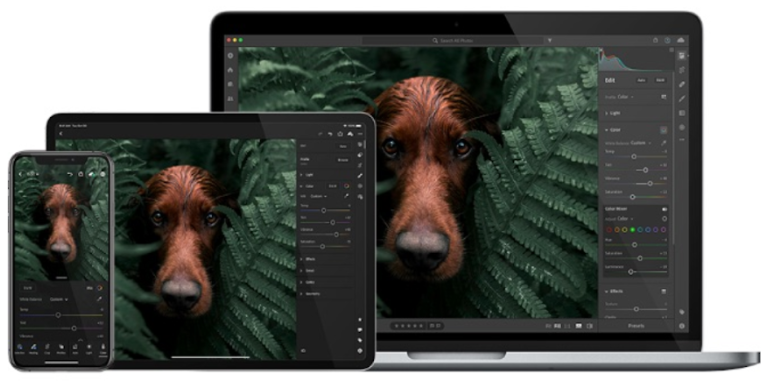 Adobe Lightroom app on a smartphone, tablet and PC. Image Credit: adobe.com
While advancing to higher versions for tablets and desktops, additional advanced effects and transitions will be included to enrich the user experience. This will ensure the smallest screen receives all the essential features, without any compromise in performance.
With graceful degradation, on the other hand, you will start the design process for a big screen, for example, a desktop. In this method, the first version for the big screen will have all the features in it. The designers will then make the app compatible for smaller screens by eliminating features or content.
Responsive web design is closely related to the concepts of both graceful degradation and progressive enhancement.
 Graphical representation of graceful degradation. Image Credit: designshack.net
Just as you thought, progressive enhancement is always better than graceful degradation. Because removing essential features would mean killing the very idea of your website.
You might be wondering, what’s the importance of these two concepts. The reason is mobile first design is a direct rule of progressive enhancement.
As its name suggests, mobile first design means starting the design from the mobile screen, as it has more limitations. And then, you work your way up to the tablet and desktop versions, adding more features as you go that direction.
For example, if a mobile-first designer sketches a website layout, they wouldn’t start with a desktop layout. Rather, they would start with how it would look on mobile and then progress, step by step, onto bigger screens.
 Mobile layout sketch by a designer. Image Credit: smashingmagazine.com
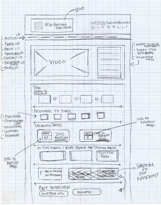 Website layout sketch example. Image Credit: webdesignforidiots.net
By following a mobile first design, you are addressing the majority of your potential customers – mobile users. A smaller screen will allow you to place only the most crucial elements that users need the most.
 Desktop version of Abercrombie & Fitch’s website
 Mobile version of Abercrombie & Fitch’s website
In Abercrombie & Fitch’s mobile website, for example, only the crucial elements needed for users to shop are included.
Why Mobile First Design Is Important?
With almost everyone using mobile to access the Internet, mobile-friendly websites are no longer a choice but a necessity. In fact, Google’s algorithm prefers mobile-friendly websites – and you don’t want to miss this boat.
User Experience
Simply put, a mobile first approach makes it easier for your customers to access your website on mobile. As the user interface of your app is first designed for a mobile device, there will be significant UX enhancements, unlike RWD.
With fewer elements, pages will load faster. Also, stuffing all the elements of the desktop version into the mobile will make things crowded and stressful for your users.
What’s more, you get to deliver a stable version of your website that offers only the essentials.
 Wired.com’s website on desktop
To make reading easier, Wired.com displays contents consecutively in its mobile-friendly site.
Mobile-First Indexing
The importance of mobile first design is directly related to user experience. Google knows how important it is to have mobile-friendly websites for UX, and so, introduced the concept of mobile-first indexing.
Mobile-first indexing means Google primarily uses the mobile version of a website for indexing its content and ranking. Before this implementation, Google had used the desktop web to do the job and evaluate a page’s relevance to a user’s query.
From July 1st, 2019, it is enabled as default for all new sites. With the majority of users accessing Google Search via mobile devices, it is the most sensible thing to do.
Mobile Conversion Rates
57% of internet users say they won’t suggest a business with a poorly designed website on mobile.
85% of adults feel a company’s mobile website should be as good or better than their desktop website.
These stats depict how important it is to have a mobile-first strategy. If you fail to have one, you lose right away.
With the majority of your customers using a smartphone to shop online, a mobile-first approach is necessary. With mobile first design, you can improve:
- Site speed
- Navigation
- Search
- Mobile-specific features (voice search, click to call, digital wallet linking and more)
- Call-to-actions (CTAs)
- Easy checkout
In short, by going mobile-first, brands can unquestionably boost conversion rates.
Mobile First Design Vs. Responsive Design
People often think these two concepts are the same. But they are on the extreme ends of a line.
 Graphical representation of responsive web design vs mobile first design. Image Credit: fredericgonzalo.com
Responsive design starts with the highest resolution device, for instance, a desktop, and then scales down to the smartphone’s screen. Although the content, layout and image contracts to fit the mobile browser, the main focus is still on the desktop version.
B2B organisations primarily adopt responsive designs – business sites accessed during office hours through a desktop or laptop – hence placing more emphasis on higher resolutions.
On the other hand, mobile first design starts with the lowest resolution device, that is a mobile, and then scales up to the highest resolution. This design gives priority to features such as easy navigation by touch, fast download speeds, precise CTAs and so on.
If you are a B2C company, mobile first design must be your strategy.
Mobile First Design Best Practices
Mobile first design makes things simpler for designers and users – designers spend less time due to fewer elements required, and users can access a clutter-free version of websites. The key is to identify how a mobile user can have a memorable experience using your site.
Content First
Give users the content they are looking for and are worth looking at – and give only that. Anything other than that will distract your users. This is the basic principle of mobile-first content.
Let’s look at two examples.
1. Trainline
 Trainline.com’s website on desktop
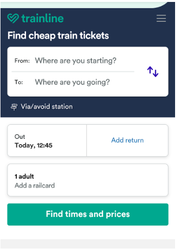 Trainline.com’s website on mobile
Key Takeaways:
- Displays the form to find cheap train tickets first – which users need the most.
- Includes other sections under the collapsible menu.
- Clear CTA.
2. Chicago Tribune
 Chicagotribune.com’s website on mobile
Key Takeaways:
- Clear CTAs – Subscribe / Log In.
- Navigation buttons are visible with collapsible sections.
- Users see news articles as soon as the website loads.
Key Content Elements to Include in a Mobile First Design
- Latest (products / news)
- Trending news or best-selling products
- CTA
- Company name
- Navigation
- Search
- The second trending news or best-selling products
- Latest blogs
Mobile First Design Process
For mobile first presentation, the first thing to do is list down all the elements to be included in a content inventory – a spreadsheet or document.
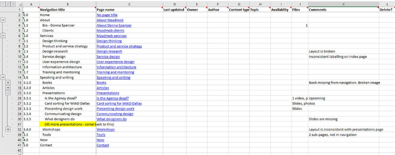 An example spreadsheet of content inventory. Image Credit: maadmob.com.au
Once you have the content inventory in place, follow these steps:
- Prioritise elements in the inventory.
- Use small breakpoints and as you expand, add larger ones.
- Enlarge buttons and ensure there’s enough space between interactive elements.
- Avoid hover and mouseover effects.
- Include interactive elements which users can interact with, without reloading the page.
- Avoid large photos and complex graphics.
- Test the site on a mobile.
You can download a content inventory template here and customise it to your needs.
Accessibility
The significant difference between a desktop and mobile website is how users interact with the elements. In a desktop environment, a mouse or a pointer is used, whereas in mobiles, fingers do all the actions. The key is to make things accessible to the fingers, especially the thumb.
 Image showing the thumb zones on a mobile screen. Image Credit: alistapart.com
As a result, you have to design for thumbs. Any locations the thumbs can reach are worthy of element placements.
 Pitchfork.com’s website on mobile.
A hamburger menu placed on the right lower corner of a screen will improve navigation. Also, it is best to place all navigation buttons at the bottom of the screen.
Optimize File Size
Images or graphics with larger file sizes result in longer loading time. This would negatively affect the UX and search ranking of your website.
Use JPEG format for photos and PNG format for graphics. There is another format named WebP that might soon rise to be the best of all.
You can improve your site’s loading speed with the help of Accelerated Mobile Pages(AMP). AMPs are web pages designed to be lightweight which enables it to load fast. To make this happen, several HTML tags aren’t allowed, along with a couple of CSS limitations. JavaScript, as a whole, is omitted from these pages.
Lazy Loading
Lazy loading is a useful technique to keep your users engaged while the page loads. It delays the loading of non-critical resources (like images) during page load and is helpful when users have a slow internet connection.
 Medium.com uses lazy loading to allow users to read content before images are loaded.
Lazy loading reduces data wastage, battery and other system resources. To ensure it doesn’t affect the image indexing of your website, use the <noscript> HTML element.
Responsive Typography
In mobiles, screen space is a precious commodity. If you use it right, you win hearts. When designing your website, you must ensure the fonts appear in mobiles without any hitch. Also, the font size must not be too small or too big.
 1987masters.com’s website on desktop
 1987masters.com’s website on mobile has a smaller font size
1987masters.com’ adjusts the font size in the mobile version for easy readability.
Disable Popups
Popups are annoying. Especially with smaller screens. Even Google, from 2016, started to impose a soft penalty on websites with popups that make content less accessible to users.
 Searchenginejournal.com’s website with popups on desktop
 Searchenginejournal.com’s website on mobile doesn’t show popups
Searchenginejournal.com refrains from displaying popups in their mobile version, as opposed to its desktop version.
If you feel that popup content can’t be replaced, try including it as a section of your website. The key is to help users access content with ease.
Use Collapsible Sections
Collapsing all your content into a single column will make things messy for your users. Instead, include multiple collapsible sections having subcategories of products or services you offer. This practice will also help you frame your desktop version better.
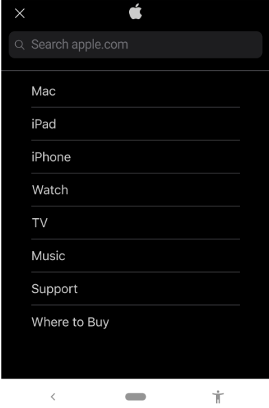 Apple.com’s website on mobile after tapping the collapsible menu
Apple.com smartly uses a collapsible menu to segment its contents. This gives a clutter-free user experience.
Optimize Forms
While shopping online, filling a form is the most frustrating thing that users come across. Inputting values into a few inches of screen is tiring especially if it isn’t a mobile-friendly website.
 Airbnb.com’s website on desktop
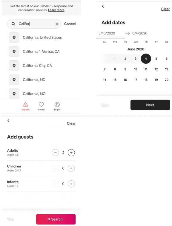 Airbnb.com splits its form into multiple steps in its mobile site. This makes it easier for users to fill the form without having to zoom or pan it.
The best thing to do-
- Reduce the number of fields on your mobile website. Include only the essential fields and omit the rest.
- Break up forms into multiple steps. If you want users to fill eight fields, break the form into two parts with four fields each, joined by a Next button.
Less Is More
Mobile first design compels you to rethink what’s really essential. It shifts focus from desktops and places it on mobile devices – which a majority of your users are using.
Anything that makes the user experience memorable is worth trying.
Hopefully, these tips have given you a better understanding of how to improve the user experience of your apps and websites with mobile first design. Follow these steps and you will witness an increase in conversion rates in no time.
If you’re looking for a top-notch Mobile App Developer, your search ends here! One of the renowned Mobile App Developer in Malaysia has what it takes to bring your mobile app ideas come to life. Reach out to them for Free Consultation.

