Table of Content
Modern smartphones currently transcend mere voice and text messaging capabilities, instead, serving as pocket computers that facilitate communications, multimedia, entertainment, personal document processing, social networking, and navigation.
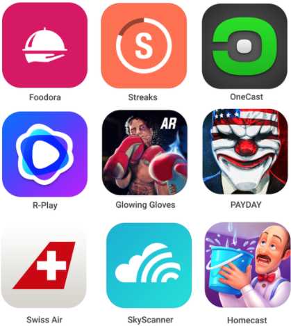
The influence of smartphones cannot be understated. And as they progress in technological capability, so do the competencies of mobile apps and graphical interfaces they maintain. A standout aspect critical to these modern apps’ success is the app icon.
What Are App Icons?
Generally speaking, an icon is a pictographic symbol that is attached to a mobile application to convey semantic meaning or represent the purpose of the application. In simpler words, an icon is a minimized graphical image that represents a mobile application or computer application, particularly during human–computer interaction (HCI). Icons for apps play an indispensable role in the human–computer field, and we all know that smartphones are essentially miniaturized computers.
Modern smartphone user interfaces constitute numerous different icons that all users of digital products interact with. Despite icons for apps being originally designed for functionality and identifiability, they are now their essential parts of brand identity, art, and design elements. As such, the aesthetics of icons now receive increased attention than ever before.
Why Do Icons for Apps and Their Designs Matter?
Of late, the increase in the number of smartphones and App Stores has generated a keen emphasis on the importance and necessity of icons as visual representatives of mobile apps. Icons for apps with attractive designs essentially increase the possibility of the application being noticed. This, in turn, motivates users to browse more details of the mobile app when searching across the App Store.
In practice, app icons enable mobile users to quickly recognize and select important information about an app. Researchers argue that mobile designers should always carefully consider the relationship between users and icons as messages can be delivered or received rapidly without language barriers through iconic representation.
Furthermore, aesthetically appealing app icons can trigger positive psychological emotions in users, thus propagating a more positive user experience. Additionally, the design of an app icon is essential for App Store Optimization (ASO). This means that in contrast to text descriptions or screenshots aimed at triggering people to want to install an app, icons share a broader scope of responsibility. This consequently means that a great icon design can be worth far more than a thousand words as a means of branding and communication.
Principles of Great Icons for Apps
With more than 1 billion mobile applications in existence worldwide, the competition among app developers has dramatically intensified with the increasing demand. That being said, appealing app icons can instantly increase an app’s attention if the icon is well crafted aesthetically.
To ensure the effectiveness and efficacy of app icons, great icons should help users to easily recognize the app’s intended message and distinguish the app from other icons. Other app icon principles to consider are:
- The icon should avoid triggering cultural conflict
- Remain in line with local and global app standards.
- The icon should always be clearly visible.
- The icon must maintain a size that is consistent with the size of the interface.
- The contour of icons must remain solid and in a closed-form as inside squares or rectangles.
- The icon must always feature primary colors, compatible with the design of other icons.
Tips to Create Great Icons for Apps
Follow Application Store Guidelines
When designing an application icon, it is imperative to strictly follow app icon design requisites provided by the application stores. Fortunately, both the Apple Store and the Google Play Stores deliver specific guidelines with regards to recommended icon design down to style specifications.
Principally, these basic requirements revolve around app icon dimensions; however, it’s essential to follow all the recommendations stated here: App Store Icon Guidelines and Google Play Icon Guidelines.
Strive for Memorability, Uniqueness, and Analyze Your Competition
A core objective during icon design is to be recognizable and memorable, especially in light of all the App Store competition. One of the ways to accomplish this is by building something unique without being overly complicated.
Another way to achieve such an objective is by evaluating the icons of your competitors and trying to go in a slightly different direction. It is important to survey your competitors’ successes, get some inspiration from them, or even copy some of their good decisions. Despite competitor analysis, it is important to always seek to build your icon to be different. So ensure that you don’t overdo it so that your app icon does not look like a carbon copy of a competitor’s.
Overall, the icon must be easy to identify among all the noise of the App stores or a homescreen. So ensure to try out several design variations and line them up on a grid and iteratively analyze which aspects of the designs catch your eye.
Carefully Consider Business Values and Branding
An app icon should maintain a consistent branding image for users to easily recognize it on all mobile platforms, stores, and environments. This means that when contemplating forms and colors, it’s important to pick those that align with the general product branding and user psychology.
Always Stick to Minimalism
Keep your app icon as simple as possible for your target audience. Since your core aim is to keep the app easily recognizable, a complicated design sadly makes it less so. Generally speaking, a sophisticated design makes an icon and app appear outdated. In turn, it appears suspicious, poor-quality, and not worth attention, which means that it can get easily ignored.
As such, it’s important to remove any design elements that can be removed without sacrificing quality and business goals. To achieve that, try to make several design iterations and variations and test them with your target audience to find out what sticks with them.
Furthermore, consider deconstructing the designs of your bigger competitors. It is safe to say that most companies are moving from previous design intricacies that once demonstrated the technical superiority of a product during the technological race, to more simple forms users resonate with.
 Pinterest app icon is an example of a minimalist icon. Image Credit: pinterest.com
Design with Scalability in Mind
Scalability is an aspect that should be carefully considered during icon design.
It’s imperative to think about all of the icon’s sizes and formats to ensure that an icon looks equally great on any device type. This is key because icons are not only visible in app stores and home screens, but also in sub-menus where they are much smaller, or even on wearable devices interfaces.
 Apple watch wearable UI interface. Image Credit: laptrinhx.com
Again, this is where minimalism also plays its role as a sophisticated icon design will not look just as great as the simple one when cramped into a small square. That being said, the idea is for it to always retain its distinct form in various sizes and environments.
Consistency While Conveying the App’s Message
For all intents and purposes, a perfect icon is not only a part of a branding initiative, but an extension of an app itself. This means that it must be flawlessly woven into the user experience, becoming its starting and finishing point.
This means that during icon design, it’s not enough to just make an icon from a logo. In practice, an aesthetic icon is intentionally made in the consistent style and colors of a product. This means that an app and its icon should always support each other. For example, a good icon always presents an app’s functions in a subtle manner.
Furthermore, designing an icon in the same visual style as a mobile app helps to meet the users’ expectations and convey the app’s purpose, without using words. This means that you should never use words on icons, but instead ‘show than tell,’ as words will overload the design with white noise. To further exacerbate issues, text elements typically look bad and are harder to read in small-size icons. However, minor exceptions can be made for one or two letters of a brand’s name, for example, “in” of the LinkedIn app icon.
 The Linkedin app icon uses letter representation. Image Credit: favpng.com
All things considered, ensure your icon functions harmoniously with your mobile application’s essence, functionality, and design. This can be achieved by keeping the color palette of the app interface and icon aligned, with a consistent design language. For example, a blue interface can be reinforced by a blue app icon.
Intentional Colors and Forms
While there is a temptation to make icons stand out with color contrasts, it’s important to control that urge. The use of vibrant colors should be conservative. You don’t need your app icon looking like a modern piece of art with a color explosion on it. You can limit yourself with a specific palette aligned with organized branding design principles and guided by color psychology.
As you set your path to a great app, start with paper sketches to creatively work towards an original and attractive shape. These sketches will allow you to experiment with different patterns and associations that come to mind. Furthermore, remember to stick to the core geometric shapes like circles, squares, and triangles to build the main icon blocks.
Extensively Test
Once you have achieved an executable app icon design, test it in several circumstances. For example, check the icon in different sizes to ascertain if it’s readable in smaller sizes and clear in larger sizes, test it with multiple backgrounds to determine it has enough contrast in it, test it in different resolutions. Lastly, compare the app icon appearance with that of competitors on the App Store and Google Play Store as well as with random icons users’ screens.
Software to Use for Icon Design
Different solutions can be used to achieve great icons for apps. However, our picks are:
- Adobe Illustrator CC (to create complex vector designs)
- Axialis Icon Workshop
- Junior Icon Editor Softorbits Icon Maker
- IcoFX
- Adobe Photoshop CC ( to create raster designs with effects like reflections and shadows)
- Sketch Design Toolkit
- Affinity Designer
 The Sketch Design toolkit. Image Credit:pcmag.com
Final Thoughts
Bottom line, smartphones have evolved from single- to multi-purpose devices with various functional add-ons and apps that support users in disparate activities. This means that effective icon design should be meaningful and visually appealing to get the attention of users. Otherwise, without quality icons, your mobile app may not be noticeable at all.
As noted earlier, it’s crucial to ensure that your iconography maintains: an unambiguous form and recognisability, understandable and unified elements, a simple design, a consistent brand message, and fits all device types and interfaces (both mobile and web).


